When decorating the room, it is also necessary to take into account important aspects of color psychology in the living space. When choosing colors, one can focus on both relaxing and activating accents.
We are all exposed to different influences every day. Physically and psychologically, our environment influences us, sometimes more, sometimes less intensively. Stress, hectic pace and pressure to perform often dominate everyday working life, news from all over the world, broadcast in fast, colorful images, let us emotionally participate in events on the other side of the globe, and small and large worries about health, partnership, family, children and, not least, finances, are in most cases omnipresent.
In order to maintain our own inner equilibrium and to keep the balance between all of this, we have developed very different techniques and mechanisms to create harmony and to flip the switch, at least for a short time. Sports activities, meetings with friends, travel, meditation and, above all, a place for rest and retreat, our home, provide the necessary time out, bring the existentially so important time of relaxation.
Designing walls individually and invitingly

A house or apartment is much more than just a roof over your head. In addition to functional criteria, our living space should also give us a sense of security, protection, peace and stimulation. Of course, kitchens, bathrooms, children’s rooms and bedrooms must first and foremost fulfill their actual purpose. As in times past, they primarily meet our basic needs for eating, hygiene, playing and learning, and sleeping.
But unlike in the past, separate areas, rather than a single, large room, create an optimal combination of clarity, closeness, distance and discretion in room design for the highest possible quality of life for each individual resident. Individuality within the community and the family is the motto of modern interior design and residential design. Individuality in the design of our living spaces has another very important aspect in today’s world. Over time, and especially in the recent past, our home has become more and more a mirror of our personality. The decoration, furnishing and last but not least the color scheme of our own four walls is an expression of our character, our attitude towards life and our philosophy of life.
Showing your colors – the courage for colorful, lively diversity

The use of colors can enliven a room, fundamentally change it or discreetly or vehemently reinforce its character. Lightness, comforting security, seemingly endless space or private comfort are directly conveyed and brought to the fore. For some years there is in the specialized trade an almost boundless selection at colors and color tones for the living space organization, which make desire and mood to change something and to lend a new coat of paint to the areas at home. In order not to turn the cheerful idea to change and redesign into overload and strain, some basic thoughts in advance are very useful.
- What is the room in question most often used for and by whom?
- At what time of day is the room mainly used and how much daylight falls into it?
- Does the room have any architectural features, such as sloping walls or a bay window?
- Are there special pieces of furniture in this room and can they become a visual highlight through clever color schemes?
- How are adjacent rooms designed?
- Can neighboring rooms form a single unit or be separated from each other in terms of design?
The answers to these questions will later facilitate the selection of suitable colors and provide helpful orientation. Various concepts, such as harmonious color arrangements or dynamic color combinations that are based on or contradict the classic color schemes, also provide valuable support in the preliminary selection of suitable colors. A personal color book that plays with favorite colors, preferred fabrics and materials, and completely different accessories perfectly illustrates and visualizes in advance the subsequent effect of the various design elements.
Do all walls have to be white?

Most people are very sparing with paint on the walls, so the majority of houses and apartments have white walls. One reason may be that we often tend to be perfectionists and for fear of making mistakes, many paint their walls white – after all, we might not be able to appreciate the color we love today in two years. Rooms in white appear fresh, calm and homogeneous – but also neutral. In addition, there is a certain reluctance to reveal too much of ourselves through the design of our own four walls. After all, color always reveals something about the identity of the occupant.
The design is always a direct expression of one’s personality. So furnishings often reveal much more about the person who lives in them than he or she would like. This is particularly interesting when it comes to companies that have to convey a certain image to the outside world with their rooms.
The key to more color courage: One’s own identity is not really subject to a trend or fashion. If you can express your personality well with colors, then the result is timeless. One will always automatically feel comfortable in such a room – even many years from now! Therefore, it is worth investing in color.
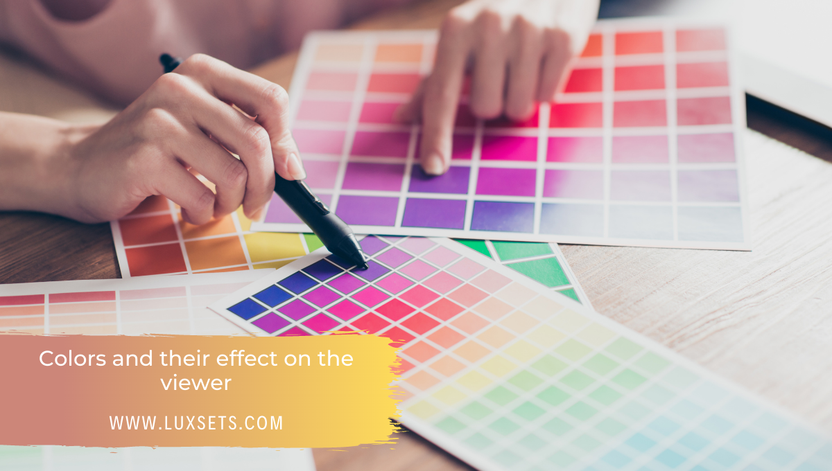
Colors and their effect on the viewer

Since the color scheme of the walls can not be changed in the blink of an eye, it makes sense to look for longer-term design options and prepare a little for the renovation. Everyone has favorite colors and shades that appeal to them in a special way and inspire them. However, not every color is suitable for every room and every wall.
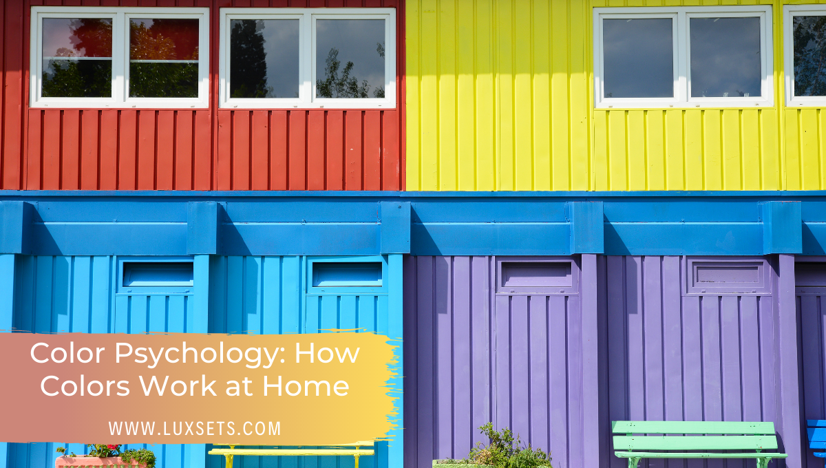
Nevertheless, today, more courageously than ever before, colors can be combined with each other and color tones can appear side by side. True to the motto of the time: whatever pleases is permitted. Colors that used to be considered mutually biting or too shrill are now setting effective accents in modern interior design. Colors have a very different influence on the mood and conjure up the desired atmosphere in a room through intensity, tinting and painting technique.
Pink looks feminine, cheerful and positive. It takes some courage to use a bright pink for wall design. For playful pink people who would like to emphasize this trait, the classic shade of pink or a subtle rosé in combination with a strong orange or dark blackberry tone is ideal. Wooden elements, curtains and bedding with floral motifs complement each other harmoniously. Cheeky pink, on the other hand, can be well accentuated with other unconventional colors. Turquoise, green-blue and yellow-green in the form of fun kitchen utensils, ceramics or glass bowls spread joie de vivre and liveliness.
Red reflects passion and sensuality and stands for confidence and sophistication. Used in living spaces, it creates warmth and red security. Like a red thread, the basic color can run through your home in various shades. Dark furniture, colorful, heavy fabrics and accents in strong orange or dark magenta decorate rooms that are meant to radiate calm and coziness.
Orange is stimulating and has a creative effect. It creates coziness and liveliness at the same time. As a color scheme, orange can be orange-dynamic or balancing, depending on its intensity. Bright color combinations with different shades of gray, lava red or a cool blue, the complementary color of the color wheel, provide an effective backdrop in a spacious entrance area. A more restrained effect is created by a more delicate orange in combination with dull yellow or green tones in the living room and conservatory.
Yellow signals optimism, vitality, cheerfulness and warmth. As a wall color, it has an inviting effect. It is also said to increase yellow brain activity. Yellow variants create a pleasant, relaxed atmosphere and can be effectively combined with dark forest green, maroon, gray-green and azure blue. Woolen fabrics and other natural materials ideally complement the shade. In combination with other citrus colors, a cheerful yellow looks good in any children’s room.
Green, the color of nature, has a friendly aura. In interior design, using shades of green is a bit of a green challenge, as the color has significantly more discernible nuances to the human eye than any other. Green, no matter the shade, has a calming and stimulating effect in equal measure, providing rest, relaxation and balance. Like all primary colors, green is great for lively, shared areas. Drab, boring rooms get more esprit by using a bold shade of green. Green is associated with naturalness and all such seeming materials. The famous Bloomsburry style from English aristocratic homes harmoniously combines a dark, yellowish green with a pale green, a brownish pink, a subtle orange, a full olive green with stylish furniture and beautiful, patterned fabrics.
Blue, as a strong primary color, like red, and yellow, is assigned to the harmonious colors of the color wheel. The color blue is a classic blue and in beautiful tones cool and soothing, visually enlarging or has a refreshing effect. Blue harmonizes with almost any other color and a coat of paint in this tone is suitable both for the dining room and for the bedroom. Blue shades are equally suitable for office interiors, as they support clear, structured thinking while creating a calm environment. An elegant, almost luxurious mood is created in combination with golden or shiny decorative elements. Accessories made of wood pleasantly warm up the cooler mood.
Purple tends to be cool or warm, depending on its respective blue or red content. Purple is of royal character and expresses creativity and stimulating seduction. Delicate lavender flowers are a fitting addition, as are shiny candlesticks, dresser handles and decanters. Purple tones look especially good in lush rooms and combine harmoniously with just such materials. Pink lilies, peonies, shades of crocus skillfully play with this color.
There are endless possibilities of variations and generally a color always matches neighboring colors of the classic color wheel. But expressive and impressive effects can be skillfully created when opposite colors, complementary colors, are combined with each other. There are no limits to the imagination. Everywhere and all the time inspiration can create space, in the truest sense of the word and own ideas can be implemented colorfully.
Further professional tips on the way to the desired color

- First of all, realize that a good color concept does not start with the decision for a certain color shade, but with the color organization. Ask yourself which areas and elements in your room should be emphasized and which should be more restrained. The tones you choose all need to match when you lay them next to each other. And very important: Three, four colors are the maximum!
- Color starts on the floor. From there, you work your way around the room. You can’t invest enough thought and energy in the floor. Because we perceive it most clearly, it is the most important element and shapes every room to a decisive degree. If the floor isn’t right, then you can’t do too much with the wall color either.
Example: If you have a yellowish oak floor, you should add a small yellow tint to the wall color. This is almost not noticeable, but makes the room look more compact and creates a basic calm. Similarly, in a room with a reddish floor, mix in a bit of red to the color.
- Continue with the walls. Now it’s time to set color focal points with the furnishings and colored surfaces. This can be your sofa, an art object or a single colored wall. The key is to emphasize only the most important elements, this creates calm. Conversely, if radiators, baseboards or furniture feet stand out in color, the opposite happens. The most intense color attracts the eye the most.
- Even awkwardly cut rooms can be improved with the help of color. What’s more, color is simply the simplest and, incidentally, the cheapest way to do this, because it can be used to direct the eye in a targeted manner. In this way, you can visually shorten or expand rooms, connect zones in perception or separate them from each other. A long, tubular room, for example, looks more compact if you paint one of the short sides in an intense tone, preferably in a shade of brown or red. Low rooms feel higher when the ceiling is lighter than the walls.
- Cool colors like light blue make rooms look bigger, warm colors make them look smaller, but also make them feel cozier. And: A secret weapon in small rooms are – contrary to popular belief – dark colors. They make the boundaries of the room disappear, the eye can no longer grasp the room contours so well.
- And the current color trends? For some years now, colors have become more muted and restrained – somehow grayish. Scandinavia, in particular, has a very skillful approach to color. There, gray with sprinkles of green, red or blue is combined with pop colors. And grayish surfaces are also well ahead in wood. Beech, for example, is currently taking a break with its bright reddish tone.
What are your favorite colors? Did you paint any walls in your home in any special colors? Let us know in the comments!


